
"Heartstopper" and the Shared Origins of Film and Comics
- Jul 14, 2022
- 5 min read
Updated: Dec 12, 2023
In Good Form: Considering the Queer Aesthetics of Netflix's Latest Hit

This is the first essay in "In Good Form," a series that close-reads the formal elements of popular culture.
Based on Alice Oseman’s webcomic of the same name, Netflix’s Heartstopper is eight episodes of sweetness. It's a refreshing, cotton-candy production that follows a group of queer English teenagers as they navigate the ins and outs of high school. It’s also a delightfully queer show, a sweet love story that forgoes the tragic tropes of queer coming-of-age stories without conveying an overly rose-colored depiction of what it’s like to be a teen today. It’s not as though Charlie, our primary protagonist, is the most popular kid in school, and while he experiences some level of homophobic bullying, it’s not as though the show revels in depicting violence against him, as so many of these stories seem to do.
In a time and place when being out and proud isn’t quite the taboo it once was, most out queer kids aren’t the only ones in their school. Heartstopper, unlike many contemporary depictions, is deeply in touch with queer kids’ tendency to stick together, a bond perhaps forged in fire but generally based in shared experiences and interests. For me, this was one of the primary pleasures of watching the show; I was seeing a depiction of queerness that I recognized, a group of queer kids — and, of course, one straight drama (or, in Heartstopper, film) nerd with strangely swoopy hair — who love and support one another, even when they feel marginalized by the rest of their peers.
Heartstopper was well-received, and successful enough that Netflix quickly ordered two more seasons. Much of the conversation about the show has revolved around representation and the subversion of traditional tropes. While this conversation is important, and certainly a significant piece of my own fondness for the show, I want to take this chance to think about Hearstopper on another level: that of adaptation.
As an academic I am particularly interested in the impact of form on our relationships with a text. Brilliant comic artists have long engaged with queer aesthetics both visually and narratively. Alison Bechdel's Fun Home, undoubtedly the preeminent queer comic, features intertwining timelines, disparate artistic styles, and a barrage of literary references. Taken together, the work forms a kind of queer aesthetic, a mix of styles and approaches that rejects conventional narrative linearity and visual cohesion in favor of a more cohesive, pathos-driven storyline, something that recalls how we receive stories from more intimate sources.
Admittedly Heartstopper is not as revolutionary or sophisticated a text as Fun Home, but some of the same principles apply, and it’s worth pointing them out. Again and again, throughout my binge of the show, I was struck by Heartstopper’s keen awareness of its own roots. Perhaps this is due to Oseman’s involvement: she is credited as the sole writer of each episode. Regardless, Heartstopper is for my money the most visually-interesting adaptation of a comic in several years; I haven’t seen anything quite as interested in replicating the form since Into the Spiderverse.
Viewers of the show will undoubtedly notice the more obvious visual references to the source material, primarily the use of split-screen imagery and hand-drawn animations that mimic the comic’s art. These features are a bit cutesy for my tastes, upon first watching, I didn’t think the show held quite tight enough to its animating (literally) artistic conceit. I wanted to see them incorporated more consistently into the work, to reflect the aesthetic values of the source text.

But as I watched, I started to clock the show’s more subtle mimicking of the comic’s imagery. Shots are constructed incredibly thoughtfully; characters are frequently framed within the shots by various lines, by lighting, by split-screens. Heartstopper’s original form embraced comic art as a queer medium, that which occupies the liminal space between visual and textual art. The aesthetics of the television production pay homage to that.
Heartstopper’s thoughtful visuals demonstrate a fundamental understanding of the shared genus between film and comics — that is, the strip. In his brilliant book Understanding Comics, Scott McCloud writes that “before it’s projected, you might say that film is just a very, very, very, very slow comic.” Heartstopper is fluent in both the language of the comic and of the screen, and it would appear that both Oseman and series director Euros Lyn share an appreciation for montage, for the way shots and angles fit together to tell a story.
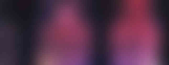
The imagery is colorful, alluding to the LGBTQ+ flag and symbolizing the broad spectrum of queerness. Perhaps owing to the fact that Nick's emotional journey is largely the soul of the first season, it's especially notable that the show is basically a physical embodiment of the term "bisexual lighting."
I was also struck by the intensive use of framing throughout the series. The environment of the show is uncannily replete with 90-degree angles, squares that frame and even divide images, directing the gaze and sometimes communicating the internal conflict or inhibitions of our characters. And yet the show never feels claustrophobic: instead, the excessive framing provides the same kind of visual order that cels do in a comic or, if you prefer, a graphic novel (many critics, including myself, argue that the term "graphic novel" creates an arbitrary distinction between high and low culture that denotes a difference in artistic merit).
Comics' sequences of cels and panels collectively form a cadence by which scenes unfold. The lines throughout Heartstopper do something similar. As the legendary twentieth-century critic Rudolph Arnheim puts it, "In a good film image, all lines and directions stand in well-balanced relation to one another and the margins. They support one another as parallels or are in contrast; they form a quiet or a restless pattern, a complicated or a simple one."


This is certainly the case in comic art; it is also true of the Heartstopper adaptation. The show's visual organization is impressive. To quote Arnheim again: "If the screen were infinitely large, there could be no question of good organization of the surface, for, in order to achieve it, there must be a limited space to organize."
Each episode also includes at least one formative montage sequence, often at the episode’s emotional apex: a snowball fight, a rugby practice, a birthday party. Even small scenes have a masterful grasp of the communicative language of single frames, such as when Nick, sitting on the couch beside a sleeping Charlie, finds himself struggling not to reach out and hold Charlie's hand.
As a form, the graphic novel conveys rhythm through the size and shapes of panels and the spaces between them; here, rhythm is built with montage and split screen, sewn together and made cohesive with the help of the show’s soundtrack. To quote Arnheim again, “the whole existence of the motion picture is dependent on this principle [of montage]... film is the montage of single frames—imperceptible montage.” Indeed, Russian cinematic pioneer Sergei Eisenstein called montage the “nerve of cinema.”

Aesthetically, Heartstopper is filled with technicolor imagery, with unnatural lighting and theatrically-perfect set design. In some ways, the pastel colors, combined with the general set design, make for a kind of artificiality, framing the love story as a fairy tale. But the story itself is clear-eyed; it understands the covert bullying and microagressions that can be regular occurrences in the lives of queer kids. So instead, the show’s aesthetics make for a celebration of the relationships that endure despite and often because of hardship and marginalization. Rather than hemming our characters in, as excessive framing often does, the linear divisions and technicolor palette of Heartstopper communicates formally the same thing it aims to show through its storytelling: the sheer variety of queer experience, the profuse spectrum of joy that can lie within living your own truth.


Comments